

Ford Motor Company were facing a crisis. A UK media firestorm erupted after somebody thought it would be a good idea to airbrush out some folk with darker skin tones on a recruitment billboard ad they were recycling. The thing is, people noticed. The next thing Ford knew, before-and-after photos were splashed across every newspaper.
Public opinion can make a real mess of a car company’s reputation in no time at all. And in a culture racing ahead with a political correctness agenda, the problem for Ford was nobody makes mops big enough to clear up that amount of mess…
In the aftermath, Ford’s human resources department had evolved and had seeded a sub-division tasked with helping Ford’s managers get to grips with the business case for diversity. After all, surely it makes more sense, the diversity business case argues, to build a workforce from all walks of life in order to conceive and deliver the most socially relevant products and solutions. Ergo, inclusion and corporate empathy is more profitable than exclusion, fear or ignorance and isn’t just the right thing to do.
But a dry, poorly designed Word document written to help managers make smart choices around diversity wasn’t going to win hearts and minds if it wasn’t going to get read. Targeted to hit the desks of every manager responsible for hiring and managing staff in Ford’s operation across Europe, I was tasked with proposing a redesign that was more likely to be read and acted on.
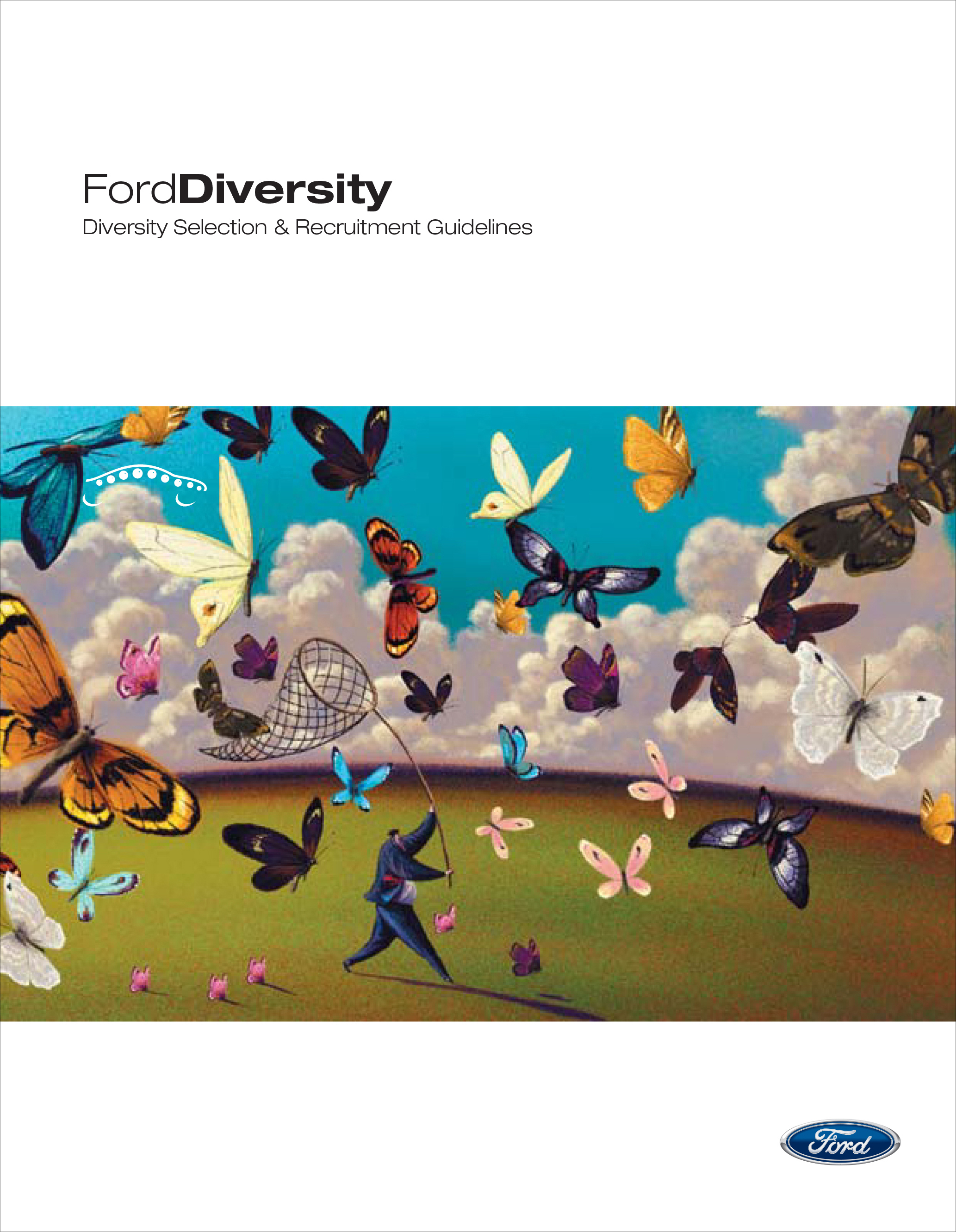
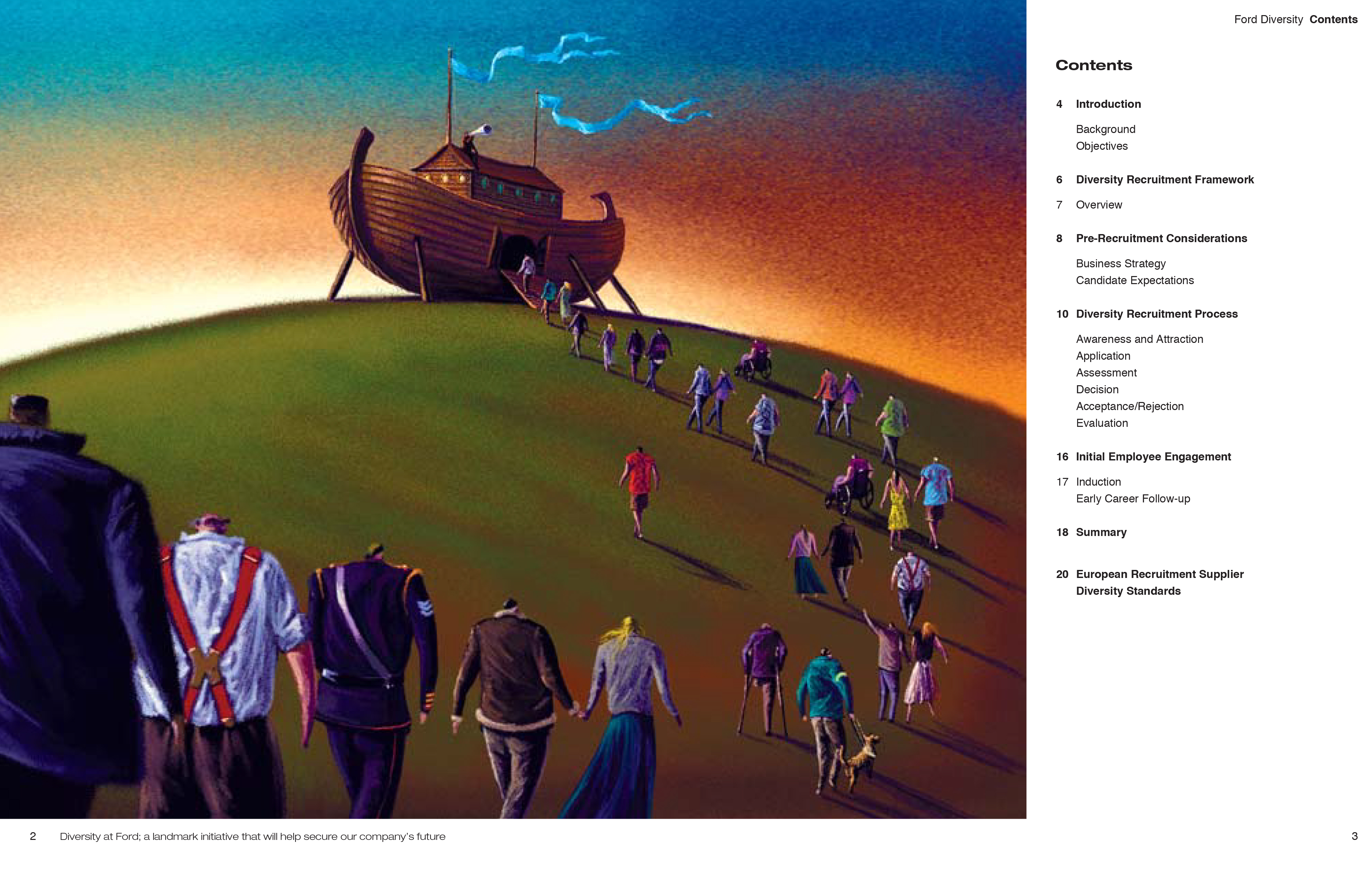
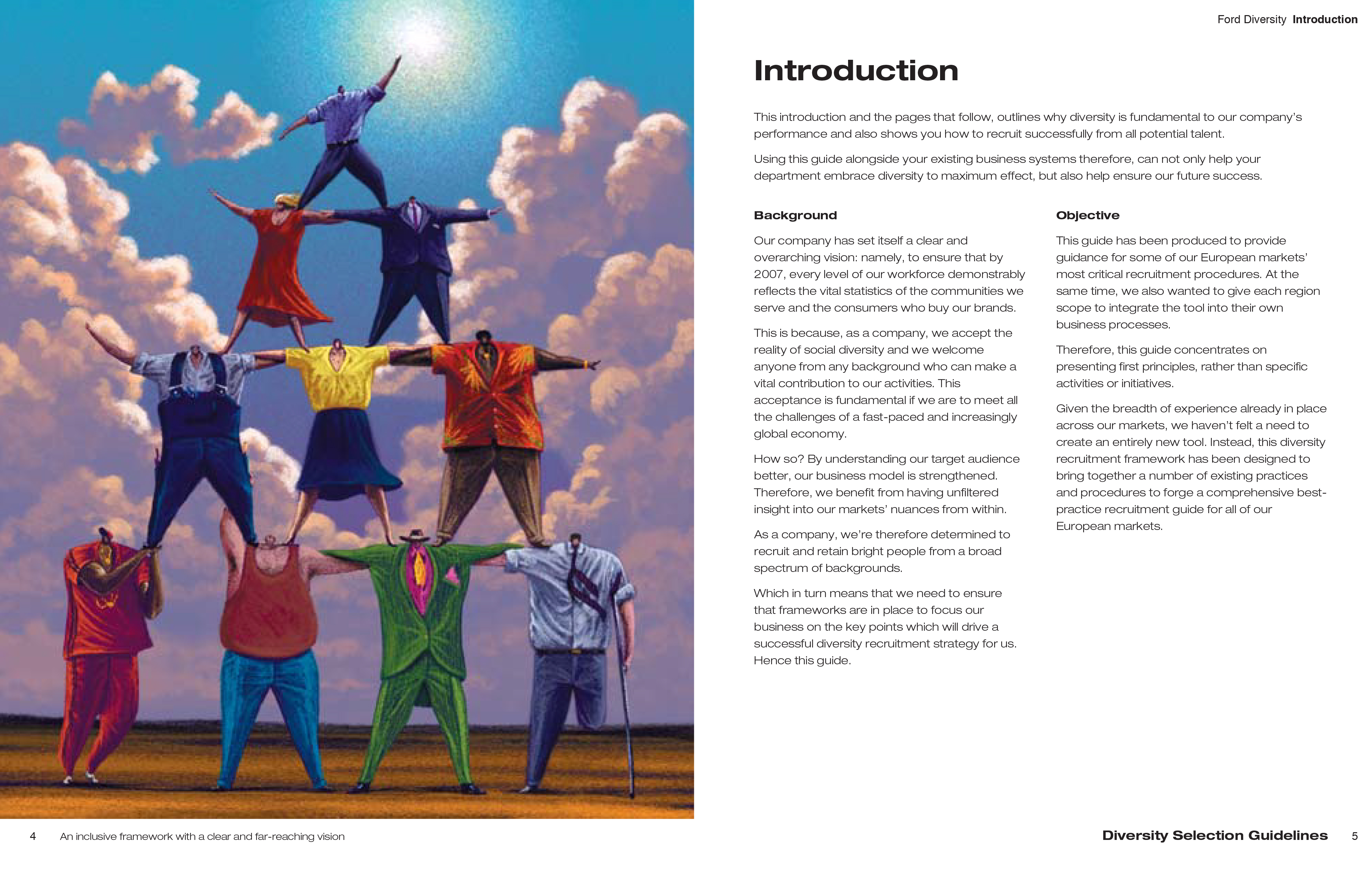
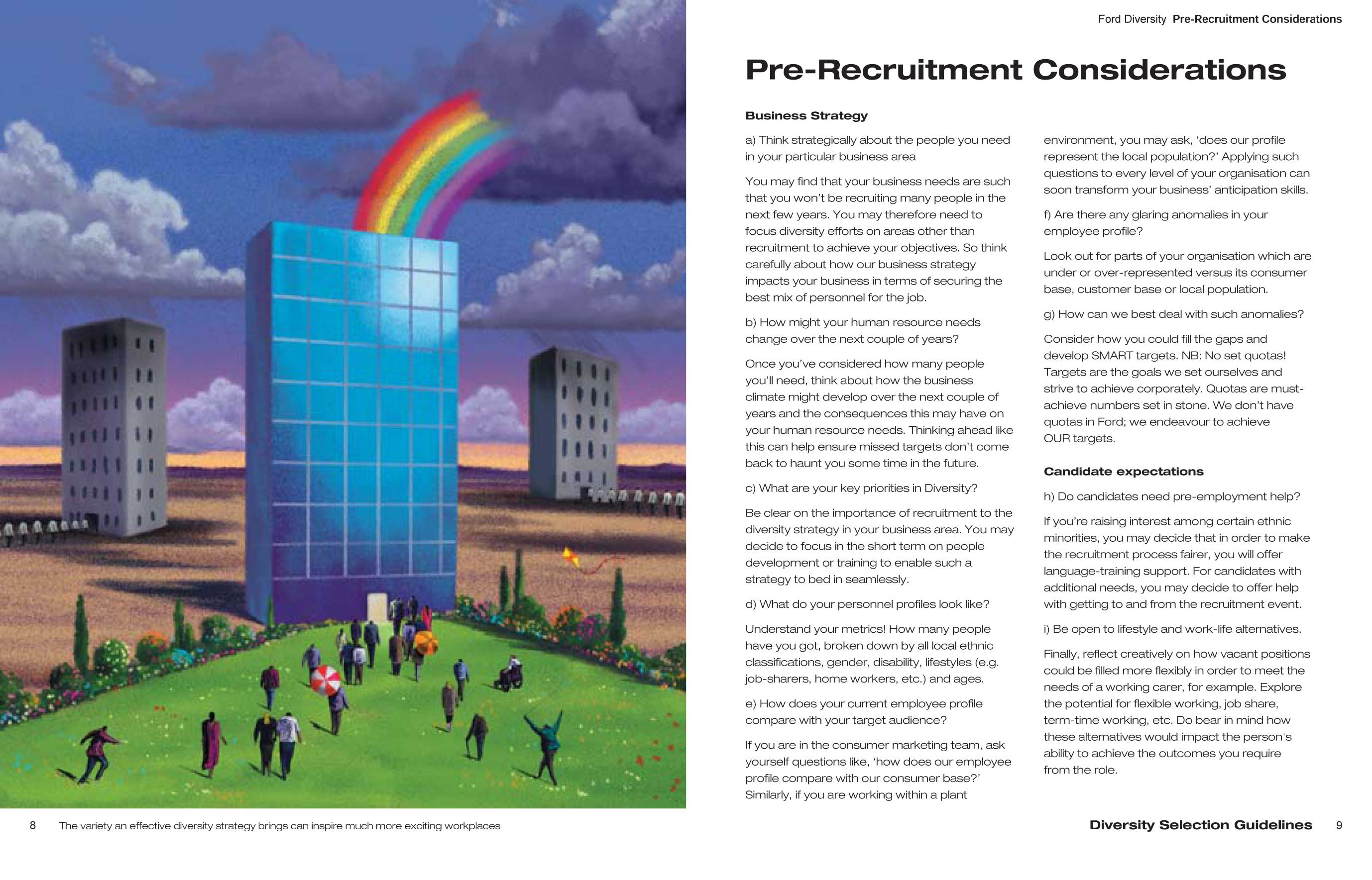
With Ford’s predilection for photography, I recommended illustration. Not only did this help the booklet to stand out, it helped keep the budget down and allowed us to use an attractive, conceptually-driven approach to ease people into the content on each spread.
I conceived the concepts for each illustration, chose and commissioned the illustrator, designed the booklet and edited the copy in line with Ford’s brand guidelines, as well as produced the artwork.
